Växel
Project type
Year
Industry
Services
Challenge
In a world where climate action and electrification is driving rapid growth in energy sources, the industry struggles to meet the adaptability needs of power grids. The electricity crisis grid owners face is a complex challenge with grid bottlenecks causing disruptions and uncertainty in power supply. Växel provides a dynamic software solution that eliminates grid bottlenecks swiftly, efficiently and allows for more capacity – ensuring a steady and reliable power supply, driving the industry forward. This newfound flexibility is the key element to a more efficient, responsive and resilient power grid.
Insight & Solution
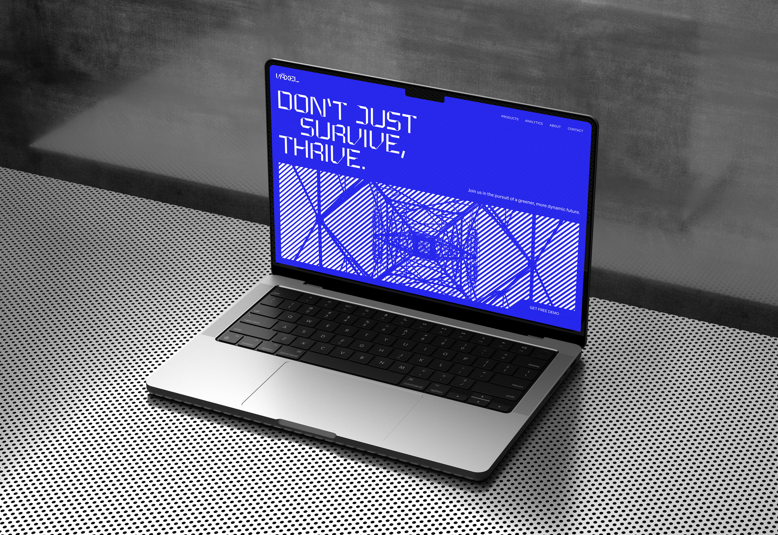
Exploring the technology of electricity gave us insight into the oscillation of electric current, a phenomenon we aimed to visually represent in our design concept. We created a custom made typeface based on this phenomenon, symbolizing electric current and flexibility – aligning with Växel’s adaptable services. This powerful typeface became the cornerstone of Växel's brand identity, influencing everything from the logo, patterns to background shapes. Through this design strategy, we secured a distinct position in the market.
The result: a coherent, memorable, and flexible brand.

Design concept
The custom-made typeface was created based on the the idea of shifting up and shifting down, symbolizing flexibility and mirroring DTR1's adaptable service. This unique and powerful typeface became the foundation of the brand identity. Every aspect of the design concept, from the logo to the shapes used as background and design elements, drew inspiration from the typeface.
Credits:
Team